Hey there, savvy ecommerce entrepreneurs and profit seekers!
Are you ready to unlock the secrets of skyrocketing sales and maximizing your profits?
Well, look no further because we’re about to embark on a journey to master the art of ecommerce conversion optimization.
In this digital age, where online shopping has become the norm, your ecommerce store’s conversion rate holds the key to your success.
It’s not just about getting traffic to your website; it’s about turning those visitors into loyal customers who can’t resist hitting that “buy now” button.
Table of Contents
So, why is conversion rate optimization so crucial?
Think about it this way: by improving your store’s conversion rates, you can generate more sales from the same amount of traffic.
It’s like uncovering a hidden goldmine within your virtual store, waiting to be tapped into.
But that’s not all! Boosting your conversion rates can lead to a domino effect of benefits. Not only will you see a surge in revenue, but you’ll also experience increased customer satisfaction, improved brand reputation, and a competitive edge in the cutthroat world of ecommerce.
Throughout this comprehensive guide, we’ll delve into the nitty-gritty of conversion rate optimization for ecommerce stores.
From analyzing user behavior and crafting a captivating user experience to optimizing product pages and streamlining the checkout process, we’ll leave no stone unturned in our pursuit of maximizing conversions.
So buckle up and get ready to transform your ecommerce store into a conversion-generating machine.
With our actionable strategies, expert tips, and real-life examples, you’ll be equipped with the knowledge and tools to take your online business to new heights.
Setting the Foundation
In this part, we’ll start by talking about something called “conversion rate.” Now, I know it sounds like a big, fancy term, but don’t worry, I’ll break it down for you.
You know when you go to a store and you buy something? Well, that’s a conversion!
It’s when someone visits a website and takes a desired action, like buying a T-shirt or signing up for a newsletter.
So, the conversion rate is just a fancy way of saying how many people actually do the thing we want them to do compared to how many people visit the website.
why is conversion rate important?
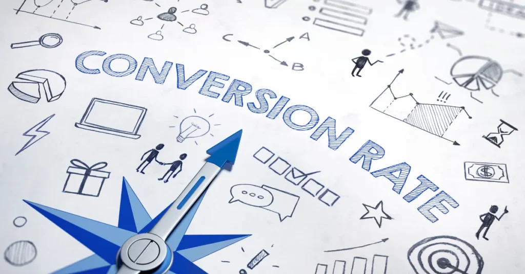
Well, think about it like this. Let’s say you have a lemonade stand.
If a lot of people come to your stand, but only a few actually buy your lemonade, that means your conversion rate is low.
But if most of the people who come to your stand end up buying your lemonade, that means your conversion rate is high.
And when your conversion rate is high, it means more people are buying what you’re selling, and that’s good for your business!
To make sure our conversion rate is high, we need to keep track of some important numbers.
These numbers are called metrics, and they help us understand how well our conversion rate optimization (CRO) strategies are working.
Key metrics to track for CRO success
Some key metrics we should track include things like the number of visitors to our website, the number of people who actually make a purchase, and the percentage of people who take the desired action.
By keeping an eye on these metrics, we can see if our CRO efforts are paying off and make adjustments if needed.
So, setting the foundation for a successful CRO means understanding what conversion rate is and why it’s important, as well as keeping track of key metrics to see how well our strategies are working.
It’s like building a strong base for a tower of blocks. If the base is solid, the tower will stand tall and strong. And that’s what we want for our conversion rates too!
Now that we’ve laid the foundation, let’s move on to the exciting strategies that can help us boost our conversion rates even more. Keep on reading!
Understanding How People Act on Your Website
You know how when you’re playing a game and you want to figure out how to win, you watch how other players move and what they do?
Well, that’s kind of what we do with websites too!
We use special tools that help us see how people behave when they visit a website.
We use these cool web analytics tools to collect information about what people do on your website.
User flow is like a map that shows us the path people take on your website. By looking at this map, we can figure out where people might be getting stuck or confused.
Conversion barriers are the things that stop people from doing what you want them to do on your website, like making a purchase or signing up for something.
By analyzing user behavior, we can identify these barriers and figure out ways to remove or fix them.
So, by studying how people move and behave on your website, we can make it easier for them to do what you want them to do.
It’s like giving them a clear path with no obstacles so they can reach their destination smoothly.
Creating a Website that Makes People Want to Buy Stuff
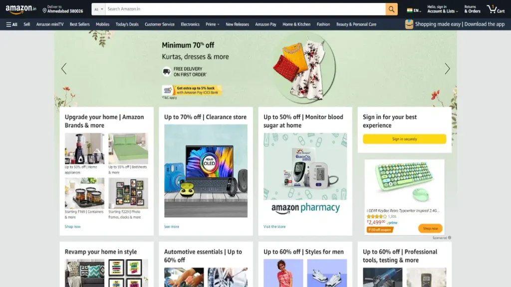
Have you ever visited a website and felt instantly excited to buy something?
Well, that’s the power of a compelling user experience!
Let’s dive into two important ways you can make your website super awesome for selling stuff.
1. Making Your Website Look Fantastic
Imagine you’re walking into a store with shiny floors, colorful displays, and friendly salespeople.
You’d feel drawn in, right?
The same goes for your website! By optimizing your website design and layout, you can make it visually appealing and irresistible to visitors.
Think about having a clean and organized design that makes it easy for people to find what they’re looking for.
Use eye-catching images and colors that make your products shine.
And don’t forget to have clear and inviting buttons that tell people exactly what to do, like “Buy Now” or “Add to Cart.”
2. Helping People Find Their Way
Have you ever been in a maze and couldn’t find your way out? It’s frustrating, isn’t it?
Well, your website shouldn’t feel like a confusing maze! You want to make it super easy for people to navigate and find what they want.
Make sure your website has clear and intuitive menus or navigation bars that show people where to go.
If you’re selling different types of products, create categories so visitors can easily explore and find what they’re interested in.
And when you want people to take action, like buying a product, make sure your “Buy” or “Add to Cart” buttons are easy to spot and click on.
By crafting a website that looks amazing and helps people find what they want, you’ll create an experience that makes them want to buy from you.
Making Your Product Pages Awesome
Okay, let’s talk about how to make your products even more amazing!
We want people to be super excited about what you’re selling, so we need to use words and pictures that make them go, “Wow!”
product descriptions
Instead of just saying, “This is a great product,” let’s make it sound like the most awesome thing ever!
Use words that show how your product can make people’s lives better or solve a problem they have.
Tell them all the cool features and benefits that make your product special. Make them feel like they can’t live without it!
Product pictures
People love to see what they’re buying, so make sure your product images are top-notch.
Take clear, bright photos that show off your product from different angles.
You want people to say, “Wow, that looks amazing!” when they see your pictures.
If possible, include pictures of people using or enjoying your product. This helps potential customers imagine themselves having a great time with what you’re selling.
But wait, there’s more!
Customer reviews and social proof
You can also make your products even more awesome by showing what other people think about them.
Customer reviews and social proof are like little gold nuggets that make your products shine.
When people see that others love your stuff and have had great experiences, they’ll be more likely to trust you and want to buy from you.
So, encourage your customers to leave reviews and showcase them on your website.
Let everyone see how happy your customers are!
Remember, the key is to make your products sound and look amazing. Use words that get people excited, take awesome pictures, and let your customers do the talking through their reviews. When you do these things, people will be lining up to buy your awesome products!
Streamlining the Checkout Process: Making It Easy to Buy Stuff
Simplifying the Checkout Process
When you’re ready to buy something online, it should be super easy, like putting your favorite chocolate in a shopping cart.
That’s why it’s important for online stores to make the checkout process simple and smooth.
To do this, they need to get rid of any extra steps that might slow you down or confuse you.
Just like when you’re playing a game, you want to get to the finish line quickly and easily.
Implementing Guest Checkout and Multiple Payment Options
Imagine going to a store and being forced to sign up for a membership before you can buy anything. That would be a hassle, right?
Well, online stores can make it easier by offering a guest checkout option.
It’s like being able to walk into a store, pick up what you want, and go straight to the cash register without any extra hassle.
Another important thing is to have different ways to pay for your chocolates.
Some people like to use their credit or debit cards, while others prefer UPI or other payment options.
By offering multiple payment options, online stores can make sure everyone can buy what they want in a way that works best for them.
So, when you’re shopping online, look for stores that make it easy to buy stuff. They’ll have a simple checkout process with no unnecessary steps, and they’ll give you different ways to pay.
Supercharging Your Store with Personalization Magic
Imagine if you had a special power to make everything just right for each person who visits your online store.
That’s what personalization does—it makes people feel like you’ve made something just for them!
Using customer segmentation for targeted messaging
Here’s the deal: not everyone is the same, right?
People have different tastes, interests, and needs.
So, to make your store extra special, we can group similar people together based on what they like.
It’s like having a secret club for people who love superheroes or unicorns!
Then, we can send messages specifically designed for each group, so they feel like you’re speaking directly to them.
It’s like having your own personalized invitation to a super cool party!
Customizing product recommendations and promotions
Okay, let’s say you’re looking for a new T-Shirt. Do you know what’s awesome?
When the store shows you other t-shirts that you might love based on what you’ve liked before.
It’s like having a friend who knows you really well and suggests the perfect T-shirt that makes your eyes light up!
That’s what customized product recommendations are all about.
They help you find things you’ll really enjoy without having to search too hard.
And guess what? Sometimes, stores even give special discounts or promotions just for you!
It’s like getting a surprise treat that makes you feel extra special.
Personalization is like having a store that knows exactly what you want and makes sure you have an amazing shopping experience.
So, my friend, by harnessing the power of personalization, you can make your store feel like it was made just for each and every person who visits. It’s like having a magical touch that brings smiles and happy customers.
Winning Trust with Social Proof: Show Off What Others Say and Prove You’re Safe
When you want people to trust your online store, it helps to have other people vouch for you.
You know how when you tell your friends about a cool gadget or restaurant, they’re more likely to want it to try right?
Well, the same thing happens with online stores.
When customers say nice things about a store and give it high ratings, it makes other people feel more confident about shopping there.
good reviews
One way is by displaying customer testimonials and ratings.
These are like little notes from happy customers saying how much they loved their shopping experience.
It’s like showing off a gold star on your homework.
When other people see these positive reviews, it makes them feel more comfortable and excited to shop at your store.
certificates and trust badges
These are like special stamps that say, “Hey, this store is safe and trustworthy!”
It’s just like when your parents tell you it’s okay to play with a new friend because their mom said they’re a good kid.
These security certifications and trust badges show that your store takes important steps to protect people’s information and keep their transactions secure.
By leveraging social proof and trust signals like customer testimonials, ratings, security certifications, and trust badges, you can build trust with your customers and make them feel confident about shopping at your online store.
So, remember to let others speak up for your store and prove that you’re a trustworthy place to shop!
Optimizing Website Performance: Speed Up Your Website Like a Super Fast Race Car
Are you ready to turbocharge your website and make it lightning-fast?
Well, buckle up because we’re diving into the exciting world of website speed and performance optimization.
You know how sometimes you visit a website, and it takes forever to load?
It feels like waiting in line for the slowest roller coaster ever.
Well, we don’t want that for your website. We want it to be as quick as a race car zooming down the track.
So, let’s get started on how to make your website speedometer hit the max:
The first step is to reduce those pesky page load times.
Imagine this: when you click on a link, you want the website to appear instantly, like magic!
Nobody likes waiting around, not even grown-ups.
So, we need to optimize your website to load faster than a cheetah chasing its lunch.
squishing your images
You know how when you take a picture with your phone, it can be really big?
Well, those big images slow down your website.
We want them to be smaller and faster. It’s like making a huge sandwich fit into a tiny lunchbox.
By compressing your images, we can make them smaller in size without losing too much quality. That way, your website will load quicker, and your visitors won’t get bored and leave.
But wait, there’s more!
optimize your code
Code is like the secret language that makes your website work. Sometimes, there’s extra stuff in the code that slows everything down, like carrying a backpack full of rocks while running a race.
We want to get rid of those rocks and make your code as light as a feather.
By cleaning up your code and removing unnecessary things, your website will speed up and perform better.
So, remember, my friend, to make your website faster than a rocket ship, you need to squish those big, heavy images and optimize your code. This way, your website will zoom onto the screen in no time, impressing everyone who visits.
Mobile Optimization: Making Your Website Work on Phones
Do you know how sometimes you use your phone to shop online?
Well, lots of people do that too!
So, it’s super important to make sure your website works well on phones. Here are two things you can do to make it happen:
1. Designing a Responsive and Mobile-Friendly Website
This means creating a website that looks good and works smoothly on different screen sizes, like big ones on computers and small ones on phones.
So, when people visit your site on their phones, everything fits nicely and is easy to see and use. No more squinting or struggling to tap tiny buttons!
2. Implementing Mobile-Specific Features and Optimizations
Phones are special, and they have their own features that can make the shopping experience even better.
You can add cool things like mobile payment options, so people can easily buy things with just a few taps.
You can also make sure that your website loads quickly on phones because nobody likes waiting forever for a page to load.
By doing these things, you’ll make sure that your website is ready for all those people shopping on their phones.
Implementing Effective A/B Testing: Making Sure Your Website Works Like Magic

1. Trying Out New Things
You know what’s cool? Testing! It’s like trying on different outfits to see which one looks the best.
But instead of clothes, we’re testing things on your website to make it work even better.
We call it A/B testing because we’re comparing two versions of something to see which one is more awesome.
2. Creating a Testing Plan
To do this testing thing right, we need a plan. It’s like having a roadmap to guide us.
We’ll develop a testing framework that tells us what we’re testing and how we’ll measure success. It’s like having a recipe for success.
3. Checking the Results
Once we’ve done our tests, it’s time to check the results. We’ll look at the data and see which version of the thing we tested worked better.
It’s like finding out which superhero has the coolest superpower. Then, we’ll take the winning version and make it a permanent part of your website.
It’s like having a secret weapon that makes your website work like magic.
4. Making Your Website Even Better
But wait, there’s more! We won’t stop at just one test. We’ll keep testing and trying new things to make your website even better.
It’s like adding more flavors to your ice cream sundae or trying out new dance moves.
We want to make sure your website is the best it can be, and testing is the way to do it.
So, let’s put on our lab coats and start testing! We’ll make your website shine brighter than a shooting star.
Exit-Intent Pop-up Strategies: Grabbing Attention Just Before They Leave
1. Implementing Sneaky Pop-ups and Special Offers
You know that moment when you’re about to leave a website and suddenly, bam! A pop-up appears.
That’s called an exit pop-up, and it’s a clever trick to catch your attention before you say goodbye.
Picture this: You’re in a cool online store, and you’re ready to click that X button. But wait! Here comes a sneaky little pop-up with an exciting offer just for you. It’s like a surprise gift that makes you think twice about leaving.
Why does it work?
Well, sometimes we get distracted or change our minds right before leaving a website.
These pop-ups give us one last chance to check out a special deal or offer that we might have missed.
It’s like a friendly reminder saying, “Hey, don’t go just yet!”
2. Bringing Back the Almost-Gone Customers
Imagine this scenario: You’re browsing an awesome website, but something suddenly distracts you, and you’re about to click away.
Before you go, though, the website tries to pull you back in.
How? By showing you a tempting offer or reminding you of something you might have forgotten.
It’s like they’re saying, “Wait, don’t leave just yet! We have something amazing to offer you!”
This strategy is called re-engagement. It’s a clever way for online stores to get your attention back and convince you to stay a little longer.
They might offer you a discount, a freebie, or simply remind you of what you were interested in.
It’s a friendly nudge that makes you go, “Hmm, maybe I should give it another shot.”
By utilizing exit-intent strategies like these, online stores can grab your attention just before you leave, giving you a second chance to explore exciting offers and find something you love.
Email Marketing for Conversions: Supercharge Your Sales with Email Magic
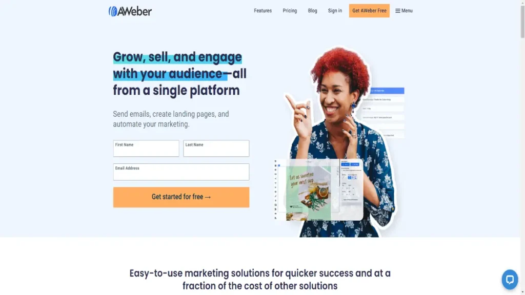
Want to know a secret to boosting your sales?
It’s something called email marketing, and it’s like having a superpower for your business.
Let’s dive into how you can use this magic to make more money!
Building Emails That Pack a Punch
Creating emails that really grab people’s attention is the first step.
You want to write messages that make readers say, “Wow, I need this!” Think about what makes your product or service special and show it off in your emails.
Use words and pictures that make people excited and curious. Remember, you’re not just selling a product; you’re selling an experience!
Keeping the Conversation Going
Once you’ve got people interested, it’s time to keep the conversation going.
That’s where lead nurturing comes in.
Imagine you’re talking to a new friend. You want to keep in touch and get to know them better, right?
It’s the same with your customers.
Send them helpful and interesting emails regularly.
Share tips, stories, or special offers that they’ll love.
Show them that you care about their needs and want to help them out.
Making Them Want More
Now, here’s a secret trick: creating a sense of urgency. You want your customers to feel like they need to take action right away.
Use words like “limited-time offer” or “exclusive deal” to make them feel special and motivate them to buy.
You can also create a countdown for a sale or offer that’s ending soon. This adds excitement and encourages them to act fast.
Getting Repeat Customers
Email marketing isn’t just for new customers. It’s also a powerful tool for bringing back the ones who have already bought from you.
Send emails to your past customers with personalized recommendations based on what they’ve purchased before.
Show them similar products or offer exclusive discounts as a way to say, “Hey, we miss you! Come back and shop with us again!”
Email marketing is like having a magic wand to boost your sales. By creating captivating emails, nurturing your leads, and making your customers feel special, you can supercharge your business.
Remember to keep the conversation going, create a sense of urgency, and bring back your awesome customers for more.
Retargeting and Cart Abandonment Strategies: Bring Back Those Lost Carts And Get Customers Back
Have you ever put something in your online shopping cart but then left the website without buying it?
Well, guess what? You’re not alone!
Sometimes we get distracted or change our minds, and those poor little shopping carts get abandoned.
But don’t worry, because smart businesses have a plan to bring those lost carts back and make the sale. Let’s find out how they do it!
Implementing Special Tricks to Get Your Attention
Businesses use a clever technique called retargeting to bring you back to your abandoned cart.
Here’s how it works: When you leave a website without completing your purchase, that website puts on its detective hat and follows you around the internet.
They show you ads reminding you about the items you left behind.
It’s like that item is saying, “Hey, remember me? I’m still here, waiting for you!”
The Power of Strategic Follow-Ups
But wait, there’s more! Businesses also use strategic follow-ups to recover those lost sales.
They may send you a friendly email saying, “Hey, we noticed you left something behind. Is there anything we can do to help?”
This kind of follow-up reminds you about your abandoned cart and encourages you to come back and complete your purchase.
Sometimes, they even offer you a special discount or a freebie to sweeten the deal.
It’s like they’re saying, “We really want you to have this, and we’re willing to make it even better for you!”
Don’t Miss Out on Your Favorite Things
So, the next time you leave an online store without buying something you really liked, keep an eye out for those sneaky retargeting ads and friendly follow-up emails.
They’re there to give you a gentle nudge and remind you about the things you loved.
It’s a win-win situation – you get to have the items you wanted, and the business gets to make a sale. Everyone’s happy!
Remember, abandoned carts don’t have to stay abandoned. With the magic of retargeting and strategic follow-ups, businesses can bring those carts back to life and make sure you don’t miss out on your favorite things.
Conclusion: Wrapping ecommerce conversion optimization
The Key to Success: Testing and Trying
To make an online store super successful, you need to keep trying new things.
Remember, testing is the secret sauce! It’s like being a scientist but for online shopping.
Try different strategies and see what works best. Keep what’s good and improve what needs a little tweak. By always testing and optimizing, you can make your store the best it can be.
( Watch 12 High Impact CRO Tips For Ecommerce Stores Video Here )
People Also Ask
What is ecommerce conversion optimization?
Ecommerce conversion optimization refers to the process of improving the performance of an online store to increase the rate at which website visitors are converted into customers.
How can I measure the conversion rate of my ecommerce website?
To measure the conversion rate of your ecommerce website, you need to track the number of visitors who take a desired action, such as making a purchase, and divide it by the total number of visitors. The formula for conversion rate is: (Number of Conversions / Total Number of Visitors) x 100. This will give you a percentage representing the effectiveness of your website in converting visitors into customers.
How can I reduce shopping cart abandonment on my ecommerce site?
To reduce shopping cart abandonment, you can take the following steps:
A. Simplify the checkout process by minimizing the number of steps and form fields required.
B. Clearly display shipping costs and any additional fees upfront to avoid surprises during checkout.
C. Offer multiple payment options to cater to different customer preferences.
D. Send abandoned cart recovery emails to remind customers about their unpurchased items and incentivize them to complete the purchase.
E. Provide guest checkout options to avoid forcing users to create an account before buying.
F. Optimize your website for mobile devices to ensure a seamless shopping experience for mobile users.
